Available fields
Text field
This is the default field type and requires no extra values. This will display a text box allowing the user to enter detail
"textfield": {
    "required": "false",
    "description": "Text Field",
    "help": "Example help for the text field.",
    "tab": "Field Types"
}
Select field
This displays a drop down list allowing the user to select a value. The only additional value required is the ‘values’ option which is a comma separated list of the values to display in the dropdown
"select" : {
    "required": "false",
    "description": "Select Field",
    "help": "Example help for a select field.",
    "tab": "Field Types",
    "type": {
        "fieldtype": "select",
        "values": "None,value1,value2,value3"
    }
}
Ajax select field
This field type is main intended for use by the core Allsky development team. It displays a dopdown list of values obtained from an ajax request.
"ajaxselect": {
    "required": "false",
    "description": "Ajax Select",
    "tab": "Field Types",
    "help": "returns data from an AJAX request.",
    "type": {
        "fieldtype": "ajaxselect",
        "url": "includes/moduleutil.php?request=Onewire",
        "placeholder": "Select a One Wire device"
    }
}
Checkbox field
This displays a ‘switch’ that can be used to turn a value on or off. This will be presented in the params data as a boolean
"checkbox" : {
    "required": "false",
    "description": "Checkbox Field",
    "help": "Example help for the checkbox field.",
    "tab": "Field Types",
    "type": {
        "fieldtype": "checkbox"
    }
}
Number field
This uses the HTML5 spinner control to allow a number to be entered. You can set the min, max and step values
"number" : {
    "required": "true",
    "description": "Number Field",
    "help": "Example help for the number field.",
    "tab": "Field Types",
    "type": {
        "fieldtype": "spinner",
        "min": 0,
        "max": 1000,
        "step": 1
    }
}
I²C Field
This displays a dialog allowing the user to select an I²C address. The dialog will display all detected devices on bus zero. A library, courtesy of Adafruit, is also available.
"I²C": {
    "required": "false",
    "description": "I²C Address",
    "help": "Example field to select an I²C address.",
    "tab": "Field Types",
    "type": {
        "fieldtype": "I²C"
    }
}

The I²C device selection dialog
When Allsky is first installed the I²C database has to be built. The ‘Update Database’ button in the dialog will rebuild the database.
GPIO Field
This field will allow the user to select a gpio pin using a graphical interface. The user simple needs to click on the pin they require.
"gpio": {
    "required": "false",
    "description": "GPIO Field",
    "help": "Example help for the GPIO field.",
    "tab": "Field Types 2",
    "type": {
        "fieldtype": "gpio"
    }
}
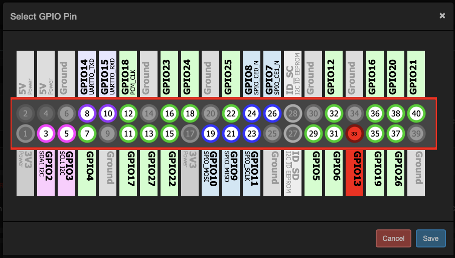
The GPIO pin selection dialog
Image Field
This allows the user to select or upload an image. Typically this would be used where a module requires a mask. This will allow the user to select the mask from the image library
"image" : {
    "required": "false",
    "description": "Image Field",
    "help": "Example help for the image field.",
    "tab": "Field Types 2",
    "type": {
        "fieldtype": "image"
    }
}
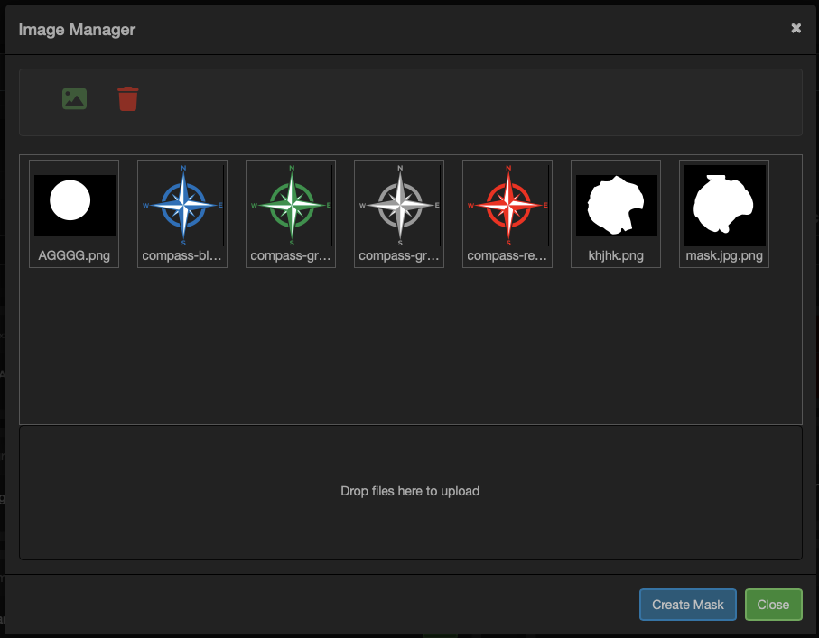
The image selection dialog
Region of Interest (ROI) Field
This allows the user to select a region Of Interest (ROI) in the image. This will then be available to the module. Typically, this would be used for things like sky brightness detection where you only want to run the calculation on a portion of the image
"roi": {
    "required": "false",
    "description": "Region of Interest field",
    "help": "Example help for the region of interest field.",
    "tab": "Field Types 2",
    "type": {
        "fieldtype": "roi"
    }
}
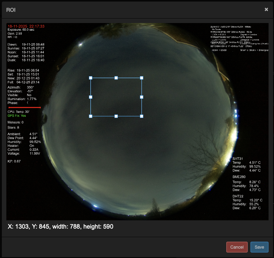
The RIO selection dialog
Variable Field
If you need the user to select another variable from within Allsky then this field type will display the variable manager allowing a variable to be selected. The ‘selectmode’ option has to options ‘single’ or ‘multi’. This controls if the user can select a single variable or multiple. Multiple variables will be presented as a comma separated list.
"variable": {
    "required": "false",
    "description": "Allsky Variable",
    "help": "Allows and Allsky variable to be selected.",
    "tab": "Field Types 2",
    "type": {
        "fieldtype": "variable",
        "selectmode": "multi"
    }
}
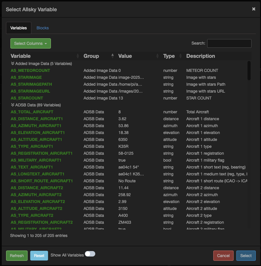
The Variable selection dialog
Position Field
This field allows the user to select a position from a map. There are three additional parameters required for this field, all refer to the name of the value in the arguments section
lat – The name of the argument to store the latitude in
lon – The name of the argument to store the longitue in
height – The name of the argument to store the height in, note height may not always be available when selecting on the map.
"position": {
    "description": "Position",
    "help": "Allows latitude, longitude, and altitude to be selected from a map.",
    "tab": "Field Types 2",
    "lat": {
        "id": "observer_lat"
    },
    "lon": {
        "id": "observer_lon"
    },
    "height": {
        "id": "observer_height"
    },
    "type": {
        "fieldtype": "position"
    }
}

The Position fields on a module dialog
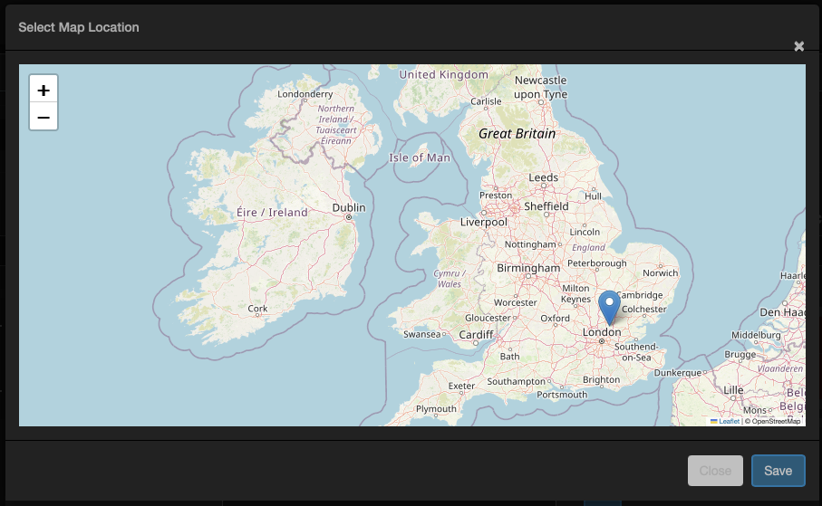
The map location selection dialog
URL Field
This field allows a url to be entered and validate using a button. The validation will check to ensure the url can be connected to.
"url": {
    "required": "true",
    "tab": "Field Types 2",
    "description": "Allows a url to be entered and then checked to see if it can be reached",
    "help": "Select a url.",
    "type": {
        "fieldtype": "url"
    }
}
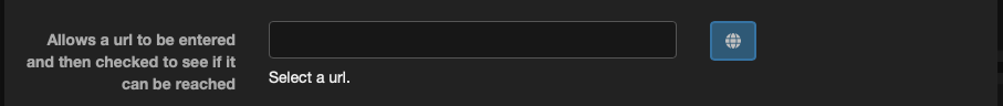
The URL entry fields
Host field
This field allows a host and port number to ben entered. There are two additional parameters required for this field, all refer to the name of the value in the arguments section
url – The url or ip address of the host
port – The port number of the host
"host": {
    "description": "Host",
    "help": "Allows a host and port to be entered.",
    "tab": "Field Types 2",
    "url": {
        "id": "influxhost"
    },
    "port": {
        "id": "influxport"
    },
    "type": {
        "fieldtype": "host"
    }
}

The Host entry fields
Graph field
This is a special field type that rather than display a field adds a new tab to the modules settings to display the history for this module.
For this field to work there are a few criteria that have to be met
- The module must be saving data to the database
- The module must have a ‘main’ chart, see the charts section for more details
"graph": {
    "required": "false",
    "tab": "Graph",
    "type": {
        "fieldtype": "graph"
    }
}
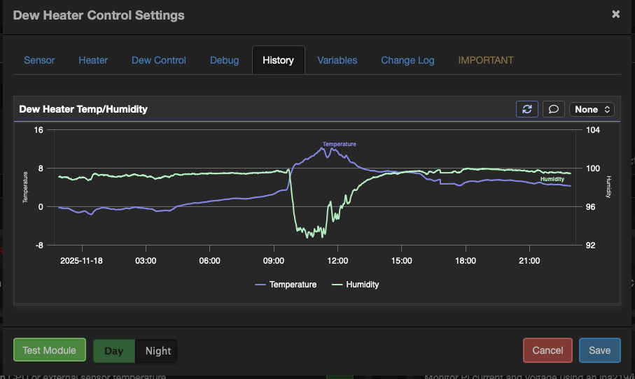
The Module Graph
Notice field
This field is used to display text on the modules dialog settings. The ‘alert’ settings utilise bootstraps alerts.
"notice" : {
    "tab": "Home",
    "message": "This module provides centralised temperature, humidity, and pressure data to other modules. This should be used in favour of dedicated sensors in any other modules which will be removed in a future release.",
    "type": {
        "fieldtype": "text",
        "style": {
            "width": "full",
            "alert": {
                "class": "info"
            }
        }
    }
}
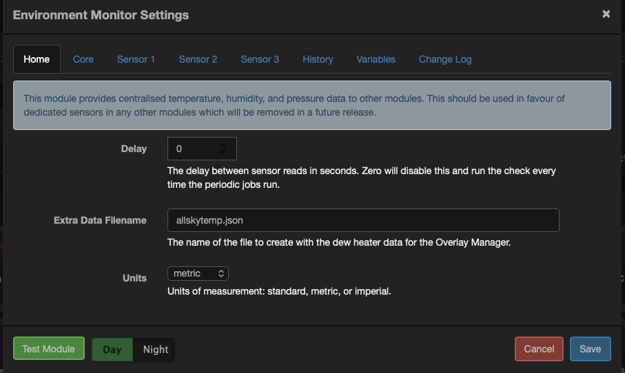
The Notice field
HTML Field
This field is used to display HTML in a modules dialog. There are a few additional settings available.
Source – Either local, where the html is read from the ‘html’ value or ‘file’ where the html is read from a file on the server using the ‘file’ value to define the source
"html": {
    "tab": "Help",
        "source": "local",
                    "html": "<h1>This help text is defined within the module</h1><blockquote>This help is hard coded into the modules config. This is ok for very short text but not good for longer text. For longer text use the file option in the field</blockquote><p>Bacon ipsum dolor amet cow …<p>",
    "type": {
        "fieldtype": "html"
    }
},
"html1": {
    "tab": "Help 1",
        "source": "file",
                    "file": "help.html",
    "type": {
        "fieldtype": "html"
    }
}
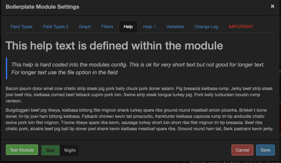
The HTML field